drdcc
July 28, 2020, 4:44am
1
Hi,
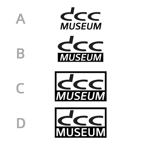
Reply with A, B, C or D for our new logo.
The world class designer‘ s (soon to be revealed) Personal choice was B.
Ralf
Here is a link to our Facebook Poll.
Ralf
2 Likes
pvdm
July 28, 2020, 6:04pm
4
“D”, because the framing of the logo symbolizes a museum (a building) to me. And the non-italic letters at the bottom make it more robust then when in italic.
2 Likes
iz0cty
July 28, 2020, 8:33pm
5
drdcc:
My New Favorite Logo is:
My New Favorite Logo is: B
3 Likes
rolf
July 28, 2020, 9:06pm
6
D. Is solid as a rock. Museum. No letters that “float” in the air and not too much italics. Practical and beautiful!
3 Likes
All are great.
I can go with B I like it
1 Like
Max
September 25, 2020, 6:51pm
11
The new logo is online here and on the website. Still needs some fine tuning, but mostly working. Looks much cleaner.
We will add forum to the logo of the forum later.
1 Like
